This post originally appeared on the Mozilla Hacks blog.
Firefox 3.6 includes many CSS improvements. In this post we’re going to show you how to use CSS gradients.
If you are running the latest beta of Firefox 3.6, you should check out our interactive demo and take a look at the corresponding code. Use the radio buttons to switch different style options on or off.
Backgrounds with CSS Gradients
Using CSS gradients in a background allows you to display smooth transitions between two or more specified colors without having to use images. This in turn reduces download time and bandwidth use, looks better while zooming, and lets you create a more flexible layout.
Firefox 3.6 supports two kinds of CSS gradients: linear (-moz-linear-gradient) and radial (-moz-radial-gradient).
Linear Gradients
To create a linear gradient, you’ll need to set a starting point and a direction (or angle) for the gradient and to define the color stops.
-moz-linear-gradient( [<point> || <angle>,]? <stop>, <stop> [, <stop>]* )
Starting Point. The starting point works just like background position. You can set the horizontal and the vertical positions as a percentage, in pixels, or using left/center/right for horizontal, and top/center/bottom for vertical. Positions start from the top left corner. If you don’t specify the horizontal or the vertical position, it will default to center.
For example, here’s a linear gradient that starts at the center (horizontal) and top (vertical), and goes from blue to white:
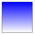
 .linear_gradient_square {
    width: 100px;
    height: 100px;
    border: 1px solid #333;
    background: -moz-linear-gradient(top, blue, white);
  }
One that starts left (horizontal) and center (vertical):
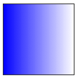
background: -moz-linear-gradient(left, blue, white);
And a gradient starting left (horizontal) and top (vertical):
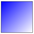
background: -moz-linear-gradient(left top, blue, white);
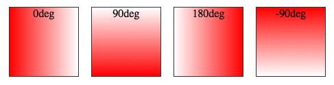
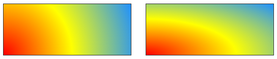
Angle. As you can see above, if you don’t specify an angle, it is defined automatically based on the start position. If you would like more control over the direction of the gradient, you can set the angle as well.
For example, the following gradients have the same starting point of left center, but the one on the right hand-side also has an angle of 20 degrees.
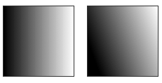
background: -moz-linear-gradient(left 20deg, black, white);
When specifying the angle, remember that is it the angle between a horizontal line and the gradient line, going counter-clockwise. So using 0deg will generate a left to right horizontal gradient, while 90deg will create a vertical gradient from the bottom to the top.
background: -moz-linear-gradient(<angle>, red, white);
Color Stops. In addition to start position and angle, you should specify color stops. Color stops are points along the gradient line that will have the specified color at the specified location (set as a percentage or length). The number of color stops is unlimited. If you use a percentage for the location, 0% represents the starting point, and 100% is the ending point, but values above and below those can be used to achieve the desired effect.
Here’s a simple example with three color stops. Because no point is specified for the first and last colors, they will default to 0% and 100%.
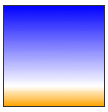
background: -moz-linear-gradient(top, blue, white 80%, orange);
Colors will be evenly spaced if no position is specified.
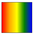
background: -moz-linear-gradient(left, red, orange, yellow, green, blue);
Transparency. Gradients also support transparency. This can be useful, for example, when stacking multiple backgrounds. Here’s a combination of two backgrounds: one image and one linear gradient from white to transparent white.
.multibackground_transparent {
  background: -moz-linear-gradient(right, rgba(255,255,255,0), rgba(255,255,255,1)), url(http://demos.hacks.mozilla.org/openweb/resources/images/patterns/flowers-pattern.jpg);
}
Radial Gradients
The syntax for radial gradients is very similar to that of linear gradients:
-moz-radial-gradient([<bg-position> || <angle>,]? [<shape> || <size>,]? <color-stop>, <color-stop>[, <color-stop>]*);
In addition to the start position, the direction, and the colors, which you have already seen in linear gradients, radial gradients allow you to specify the gradient’s shape (circle or ellipse) and size (closest-side, closest-corner, farthest-side, farthest-corner, contain or cover).
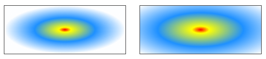
Color stops. Just like with linear gradients, you should define color stops along the gradient line. The following circles have the same color stops, but the gradient on the left defaults to evenly spaced colors, while the one on the right has a specific position for each color.
background: -moz-radial-gradient(red, yellow, #1E90FF);
background: -moz-radial-gradient(red 5%, yellow 25%, #1E90FF 50%);
Shape. Here you can see the difference between the two possible shapes, a circle (on the left) and an ellipse (on the right), both with a bottom left starting point:
.radial_gradient_circle {
  background: -moz-radial-gradient(bottom left, circle, red, yellow, #1E90FF);
  }
.radial_gradient_ellipse {
  background: -moz-radial-gradient(bottom left, ellipse, red, yellow, #1E90FF);
  }
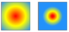
Size. The different options for size (closest-side, closest-corner, farthest-side, farthest-corner, contain or cover) refer to the point used to define the size of the circle or ellipse.
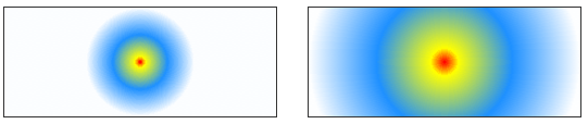
Example: closest-side vs. farthest corner for an ellipse. The following two ellipses have different sizes. The one on the left is set by the distance from the start point (center) to the closest-side, while the one on the right is determined by the distance from the start point to the farthest corner.
background: -moz-radial-gradient(ellipse closest-side, red, yellow 10%, #1E90FF 50%, white);
background: -moz-radial-gradient(ellipse farthest-corner, red, yellow 10%, #1E90FF 50%, white);
Example: closest-side vs. farthest-side for a circle. The size of the circle on the left is determined by the distance between the start point (the center) and the closest side, while the one on the right is the distance between the start point and the farthest side.
background: -moz-radial-gradient(circle closest-side, red, yellow 10%, #1E90FF 50%, white);
background: -moz-radial-gradient(circle farthest-side, red, yellow 10%, #1E90FF 50%, white);
Example: contained circle. Here you can see the default circle on the left, and the version of the same gradient but contained on the right.
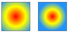
background: -moz-radial-gradient(red, yellow, #1E90FF);
background: -moz-radial-gradient(contain, red, yellow, #1E90FF);
Repeating Gradients
If you would like to repeat a gradient, you should use -moz-repeating-linear-gradient and -moz-repeating-radial-gradient.
In the examples below, four color stops are specified in each case, and are repeated indefinitely.
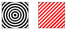
.repeating_radial_gradient_example {
  background: -moz-repeating-radial-gradient(black, black 5px, white 5px, white 10px);
}
.repeating_linear_gradient_example {
  background: -moz-repeating-linear-gradient(top left -45deg, red, red 5px, white 5px, white 10px);
}
Demo
Check out our interactive demo of linear and radial gradients for more examples.
Note that the gradient syntax has changed between Firefox 3.6 beta 1 and beta 2, so if you used gradients with beta 1, you may need to update your code.